

Stellar Sprint // 2023 Minor 5-month Project
Roguelike menu system · 2023 · Tags: UI Design, Game Menu, Prototype

HUD Color Exploration
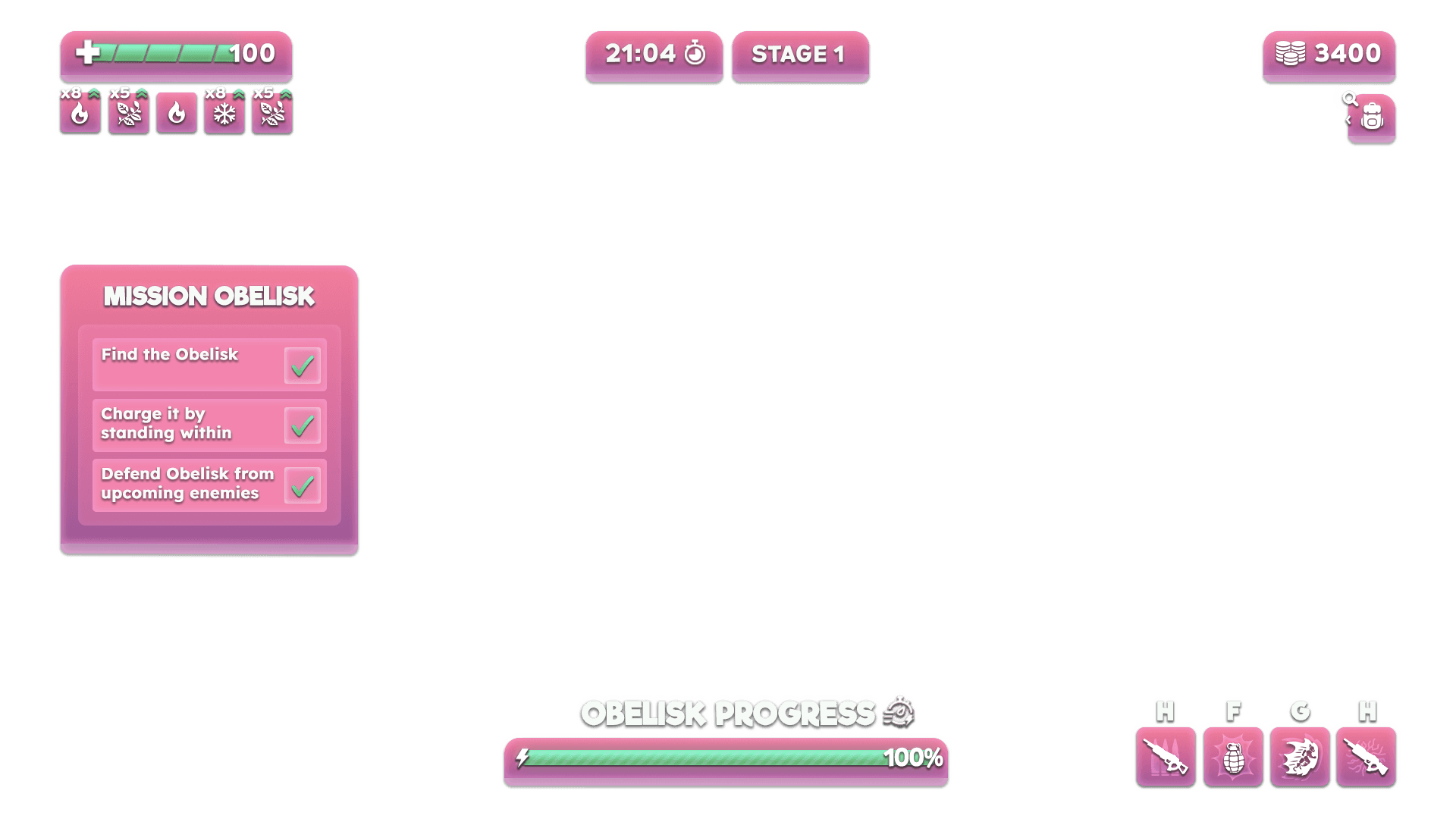
Before settling on a final visual language, the in-game HUD was tested across two color directions: a warm magenta-pink and a cooler blue. Both used identical layout and iconography, isolating color as the only variable, which made it easier to judge contrast and legibility against Stellar Sprint’s saturated, painterly environments independently of layout decisions. The magenta variant was carried forward, reading more clearly against the game’s mixed rock-and-foliage palette.

Rapid Prototyping in Figma & Unity Cinemachine
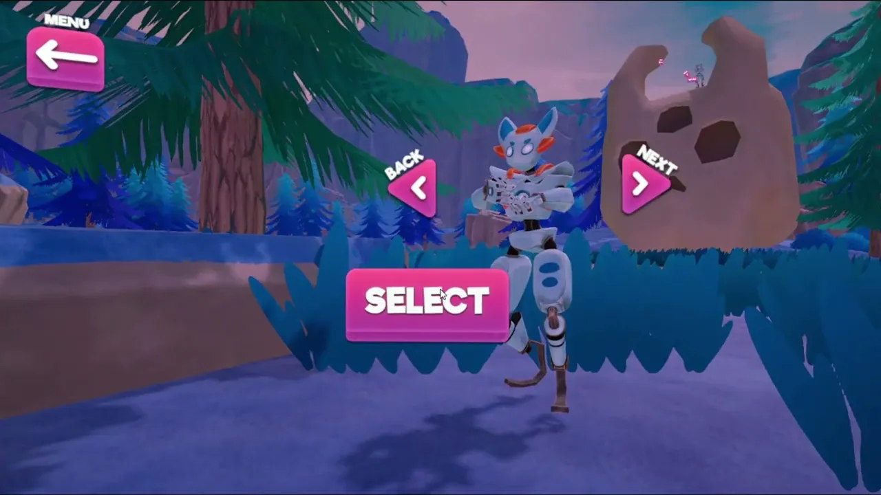
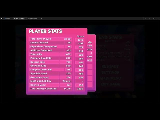
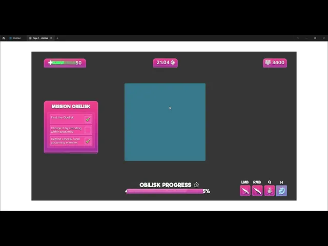
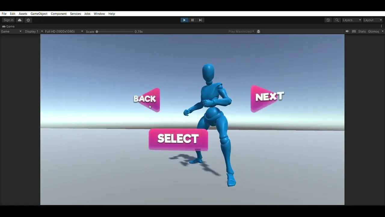
Fast iteration ran across both interface and camera work. Figma let interface changes be mocked up and click-tested in hours instead of days, so layout, hierarchy, and flow could be validated before a single line of UI code was written. In parallel, Unity's Cinemachine was used to experiment directly in-engine, swapping virtual camera rigs, testing blend curves, and previewing transitions between gameplay and the diegetic main menu without hand-tuning interpolation manually. Both tools served the same purpose: catching what didn't feel right before it was locked into a shipped feature, keeping the gap between idea and validated direction as short as possible.

HUD In Context
Once the palette was settled, the HUD was validated directly in the 3D environment rather than in isolation. Placed over the Mission Obelisk sequence, elements like the resource counters, elemental ammo types, and the Obelisk Progress bar needed to stay legible against a bright sky and dense foreground geometry, a stress test that isolated mockups can’t fully replicate.


Item Rarity Feedback
Pickups reuse the same color system established in the HUD, extending it into a three-tier rarity language: gold for Legendary, magenta for Rare, blue for Common. This is paired with a star rating for quick secondary confirmation. The goal was for players to gauge an item’s value at a glance mid-combat, without stopping to read the full tooltip.


Development Process
Alongside the interface work, production was planned across a 20-week timeline spanning concepting, prototyping, four iteration cycles, and final documentation. Feedback moved through a defined pipeline: ideas were researched and mocked up in Photoshop, validated with the team through a quality-control pass, then built out as Figma prototypes or Illustrator icon sets before implementation and playtesting giving every design decision a clear paper trail from idea to shipped feature.


Style Direction Exploration
Before Stellar Sprint's identity was locked in, concepting explored four distinct art directions in parallel : a colorful, creature-driven roguelike, a dark medieval dungeon crawler, a gothic wizard game, and one additional direction. each built out as its own stylesheet with a dedicated color palette, typography pairing, genre tags, and curated UI/UX references. Comparing full directions side by side, rather than polishing one in isolation, made genre fit easier to judge against Stellar Sprint's fast, replayable structure before committing engineering time to any single visual language. The colorful roguelike direction with warm gradients, rounded iconography, playful tooltip styling won out, and its palette carried directly into the HUD color work that followed.


Settings & Accessibility
The settings menu was built around player control rather than fixed defaults. Interface options let players reposition the objective panel, ability tray, and timer, and scale menu text independently. Controls are fully rebindable across movement, abilities, and world-space interactions, and audio is split into five independent channels: master, music, effects, hit markers, and UI. This is so players can mix the experience to their own preference.